Dataview
- 21 Oct 2024
- 12 Minutes to read
- Contributors


- Print
- DarkLight
Dataview
- Updated on 21 Oct 2024
- 12 Minutes to read
- Contributors
- Print
- DarkLight
Article summary
Did you find this summary helpful?
Thank you for your feedback!
The dataview control allows you to present tabular data in a visually appealing and user-friendly interface. You can seamlessly showcase information with diverse layouts, allowing for customization based on specific needs.
The dataview usually allows your users to select 1 item from a set of different options.
Here is an example of such a dataview showing a list of vertically stacked products, where the second one is currently selected and the last one is disabled as it is out of stock at the moment:
Quick start
The data shown in a dataview usually comes from a table component. It can also come from a record component but that is an older approach which is not recommended anymore.
Each record (or row) in the connected table component is represented by 1 entry (or item) in the dataview. The example dataview shown above, is connected to a table component which consists of 4 records.
The usual workflow to populate the dataview with data looks like this:
- Create a table component which queries the data you'd like to show from a data source.
When using the dataviews default layout, you need to ensure that your query results in at least 2 columns namedvalue&text.
You can rename the columns of your data source if it does not come with avalue&textcolumn. See projecting the data in the table component documentation for more details on how to rename columns in a query. - Enable Hive for the dataviews
entriesproperty by clicking on the code icon next to the properties input field. - Get the data from the table component by writing a simple script like
NameOfTableCmpin theentriesproperty.
See how to connect the data and how to handle user selections for more details on how to properly prepare the connected table component etc.
Layouting
You can either use the default layouting options which allows you to show exactly 1 text and 1 image per item (or entry) or you can use a custom layout which gives you the freedom to provide your own HTML layout and show arbitrary data.
The dataview uses the default layout when the custom layout property is not set. You can find a set of customization options for the default layout within the item layout section in the dataviews property list. Those properties allow you to show/hide the text, position it, change the font, adjust spacings & sizes etc.
You can always use custom CSS to further customize the look of your dataview but you cannot change the shown content with a default layout which is where the custom layout comes into play.
How to connect the data
The entries property is where your dataview receives its data to show from. You usually connect it to a table component which queries data from a data source like an Excel file.
You usually want to directly reference the records of a table component which you can do by first activating Hive for the entries property and then simply writing the name of the table component into the property.
You cannot write queries directly into the entries property as queries can only run in table components.
How to prepare the table component
Default layout
When using the default layout (i.e. when property custom layout is not set), your table component needs to provide columns with the following names:
value(required)text,imageUrl,itemTooltip&itemDisabled(all optional)
If your data source comes with columns of different names, you can rename those columns within the table component query.
Here is an example of how that could look like for a data source named ProductsData which comes with columns named Id, Name & InStock:
from ProductsData select {
  // Rename column `Id` to `value`
  .value = .Id,
  // Rename column `Name` to `text`
  .text = .Name,
  // Rename column `Name` to `itemTooltip`
  .itemTooltip = .Name,
  // Rename column `InStock` to `itemDisabled` and invert its value
  .itemDisabled = not .InStock
}
See projecting the data in the table component documentation for more details.
Custom layout
When using a custom layout, you can use arbitrary column names. See the custom layouts section for more details on how to structure & use the data in a custom layout.
There are only 2 columns with special meaning when working with a custom layout:
- The first column is always considered the unique value of a given record. The dataview uses this value to decide which item to select & when writing selection changes back to the components. See how to handle user selections for more details on this.
- A column named
itemDisabledcan be used to disable items in a dataview.
Minimize the data
All data within your table component will be transmitted to the configurator. Including data which is not needed by the dataview can make the configurator slow, especially for users with slow internet.
A good rule of thumb is to only include the columns in your query which you actually want to show in your dataview.
When using the default layout, this is only columns named value, text, imageUrl & itemDisabled. When using a custom layout, you should only include the columns which are actively referenced in your custom layout template and nothing else.
You can always check which data is transmitted to the configurator by selecting the dataviews entries property. All data shown in the result view is transmitted to the configurator.
How to use data from a record component
Accessing data from a record component pretty much works the same as accessing data from a table component. The only difference is that you need to write #NameOfRecordComponent.Records (note the #) into the entries property instead of just the component name like with table components.
How to handle user selections
The dataviews value property is used to tell the dataview which item to select and can be used to write selection changes back into a component using the dataviews value changed slot.
When using a default layout, you usually set this property to the value of the value column in your connected table component. When using a custom layout, you set it to the value of the key column which is always the first column in a table component.
Dealing with user selections in a dataview usually consists of the following parts:
A table component which is connected to the
entriesproperty and provides the data to show (see how to connect the data).
Let's call this componentProductsTablehere.A value component which holds the record of the selected entry e.g. named
SelectedProduct.
Use the "Create selection component" button in the table component editor to let the system create this component with a sensible default rule for.Reflecting
SelectedProductas selection in the dataview:
To achieve this, simply activate Hive for the dataviewsvalueproperty and writeSelectedProduct.valueinto the rule.
When working with custom layouts, the namevaluecould vary and is the name of the first column in your connected table component.Updating
SelectedProductwhen the dataview selection changes using SigSlo:
Signaldataview.ValueChanged, slotSelectedProduct.SetValuegiven thevalueproperty of the dataview.
If the value property is not set or set to some invalid value, no item is selected.
The selection is usually represented by some highlighting like a different colored border, different background etc. for the selected item.
When using the default layout, you can use the properties within the item layout section to customize this highlighting.
If you need more flexibility, you can always use custom CSS to customize all items which match the selector .cfgr-dataview-item.cfgrctrl-selected within your dataview. This also works for custom layouts!
Custom layouts
With the default layout, the dataview can show exactly 1 text and 1 image and gives you a few basic options to customize the layout (position of text & image etc.).
The custom layout property gives you the freedom to provide your own HTML layout and show arbitrary data.
How to define the layout
Within the custom layout you can write pure HTML with the additional option to access data coming from the entries property (i.e. data from a table component).
Since we also allow you to access data from your table component in this HTML, this is not strictly HTML but actually a HTML template which is why we'll be referring to this HTML as "template" from now on.
The template you write here is automatically repeated for every entry in the dataview. Also, each entry is automatically wrapped inside a div with the class .cfgr-dataview-item which is the same as for entries in a default layout. This div is needed because it also provides you helper classes like .cfgrctrl-selected & .cfgrctrl-hover with which you apply different styles to selected & hovered items in your custom layout as well.
See control DOM & CSS classes for more details on those automatically added classes we just mentioned.
For example, when using the template <div>hello!</div> and connecting entries to a table component with 3 records, you'll see the text "hello!" repeated 3 times in your dataview and the final HTML in the configurator will look like this:
<div class="cfgr-dataview-item"><div>hello!</div></div>
<div class="cfgr-dataview-item"><div>hello!</div></div>
<div class="cfgr-dataview-item"><div>hello!</div></div>
Obviously, it doesn't make much sense to repeat the same static content over and over again which is why the next section will explain how to put actual data into your template.
How to access the data
In order to inject data from the connected table component into your HTML template, you can add template blocks starting with {[ and ending with ]} to your template. Within those blocks you can write JavaScript code which is executed at runtime, when rendering the dataviews entries.
Access to all data from the connected table component is provided through an object named values which you can use within the template blocks. All columns from the connected table component are accessible as properties of this values object.
E.g. if the connected table component consists of columns named Key, Title, Size & PricePerLiter, you can access the corresponding data using {[ values.key ]}, {[ values.title ]}, {[ values.size ]} & {[ values.priceperliter ]} within the custom layout template.
The properties accessed within the values object need to be written all lower case, no matter how they're actually named in the table component.
E.g. the column named PricePerLiter needs to be accessed using values.priceperliter.
If the column value you're accessing is not of a primitive type like number, text or boolean, but a more complex object like an image, you have to use the correct casing to get its sub properties.
Imagine a column named Thumbnail which is of type image. This image is an object which consists of properties like Url, Width & Height. If you'd like to get the URL of the image, you have to write values.thumbnail.Url where thumbnail is all lower case and its property Url is still camel cased.
Debugging tip
If you're unsure how the properties within your values object are actually named or structured, you can use the following trick:
Use the template block {[ console.log('values:', values) ]} anywhere within your template. This will print the values of each record to your console whenever the dataview renders new content which allows you to investigate the values object in detail.
Remember: Within the template blocks {[ ... ]} you can write any kind of JavaScript code which is executed at runtime!
How to disable items
The dataview automatically disables all items whose corresponding record in the connected table component has a value of true in a column named itemDisabled.
Those disabled items come with a default styling (reduced opacity). If you'd like to adjust this styling, you can do so by providing your own styles in custom CSS for elements with the classes .cfgr-dataview-item.cfgrctrl-disabled within your dataview.
How to add a tooltip
Similar to "disabling items" it's also possible to add a tooltip.
To do so, simply add a column named itemTooltip with the desired text in the connected table.
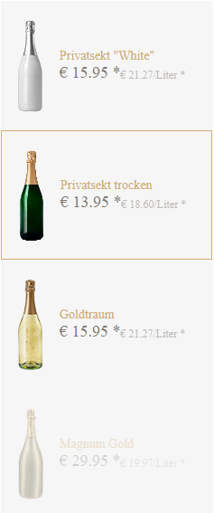
Usage example
Imagine a table component named ProductsTable with the following query:
from Products select {
  .Id, .Title, .DetailText, .Size, .PricePerLiter, .Thumbnail, .itemDisabled
}
Now you'd like to show this data in the following form:
You can achieve this layout using the following property values:
- Entries:
ProductsTable(activate Hive for the property!) - Custom layout:
<div class="products-dv--background" style="background-image: url({[ values.thumbnail.Url ]});"></div>
<div class="products-dv--title">{[ values.title ]}</div>
<div class="products-dv--priceWrapper">
  <div class="products-dv--priceTotal">€ {[ (values.priceperliter * values.size).toFixed(2) ]} *</div>
  <div class="products-dv--pricePerLiter">€ {[ values.priceperliter.toFixed(2) ]}/Liter *</div>
</div>
As you can see in the custom layout template above, you can write fully functional JavaScript inside the template blocks ({[ ... ]}). This means that you can also perform calculations, formatting etc. there if needed.
E.g. values.priceperliter * values.size).toFixed(2) is vanilla JavaScript.
Obviously, this also needs some custom CSS to look like the dataview shown above but I leave this as an exercise to the reader.
Hint: You can provide your own classes in the template (like products-dv--background in the custom layout above) and use those classes to style the entries.
Adding interactive elements to the template
You can also add interactive elements like buttons to the template. One use case of this would be to show a plus and a minus 1 button on each element which adds or removes items from a cart.
Whilst you cannot interact with those buttons directly in Hive or via SigSlo, you can always use custom JS to deal with button clicks etc.
Here's a very simple example, showing how you can add such buttons & how to react on clicks in custom JS:
Template:
<div>{[ values.title ]}</div>
<button class="add-button" data-item-id="{[ values.id ]}">+1</button>
<button class="remove-button" data-item-id="{[ values.id ]}">-1</button>
Custom JS:
CfgrUtils.onCfgrReady(() => {
  // ...

  $('.cfgr-dataview').on('click', '.add-button', (event) => {
    // Get info about clicked row from `data-item-id`:
    const itemId = event.currentTarget.dataset.itemId;
    // ...
  });

  // ...
});
There are 2 things to be especially aware of:
- Ensure that the click listener is installed after the control has surely been rendered. E.g. in callback to CfgrUtils.onCfgrReady.
- Don't install the click event on the button itself but use event delegation on the dataview to "get to the button".
In the example above, this is why we're using$('.cfgr-dataview').on('click', '.add-button', () => ...)instead of$('.cfgr-dataview .add-button').on('click', () => ...).
Events installed directly on the button would probably work initially but won't work anymore after the items in the dataview change at runtime as all dataview items are destroyed & re-created on such updates.
More advanced use cases
The templates for our custom layouts are powered by a technology called XTemplates from ExtJS. Therefore you can also use most of the features they're providing in your templates as well.
Since we couldn't do a better job in explaining them, then the ExtJS team itself, we don't even try and refer you to their excellent docs to find out more about what is possible:
https://docs.sencha.com/extjs/6.2.0/classic/Ext.XTemplate.html
Was this article helpful?