Create a basic 3D configurator
- 20 Sep 2024
- 6 Minutes to read
- Contributors


- Print
- DarkLight
Create a basic 3D configurator
- Updated on 20 Sep 2024
- 6 Minutes to read
- Contributors
- Print
- DarkLight
Article summary
Did you find this summary helpful?
Thank you for your feedback!
The goal is to create a basic 3D Mokapot configurator. The user should be able to
- change the color of the upper and lower part
- open and close the lid
- set a individual motive for the bottom part
- view the Mokapot in AR mode
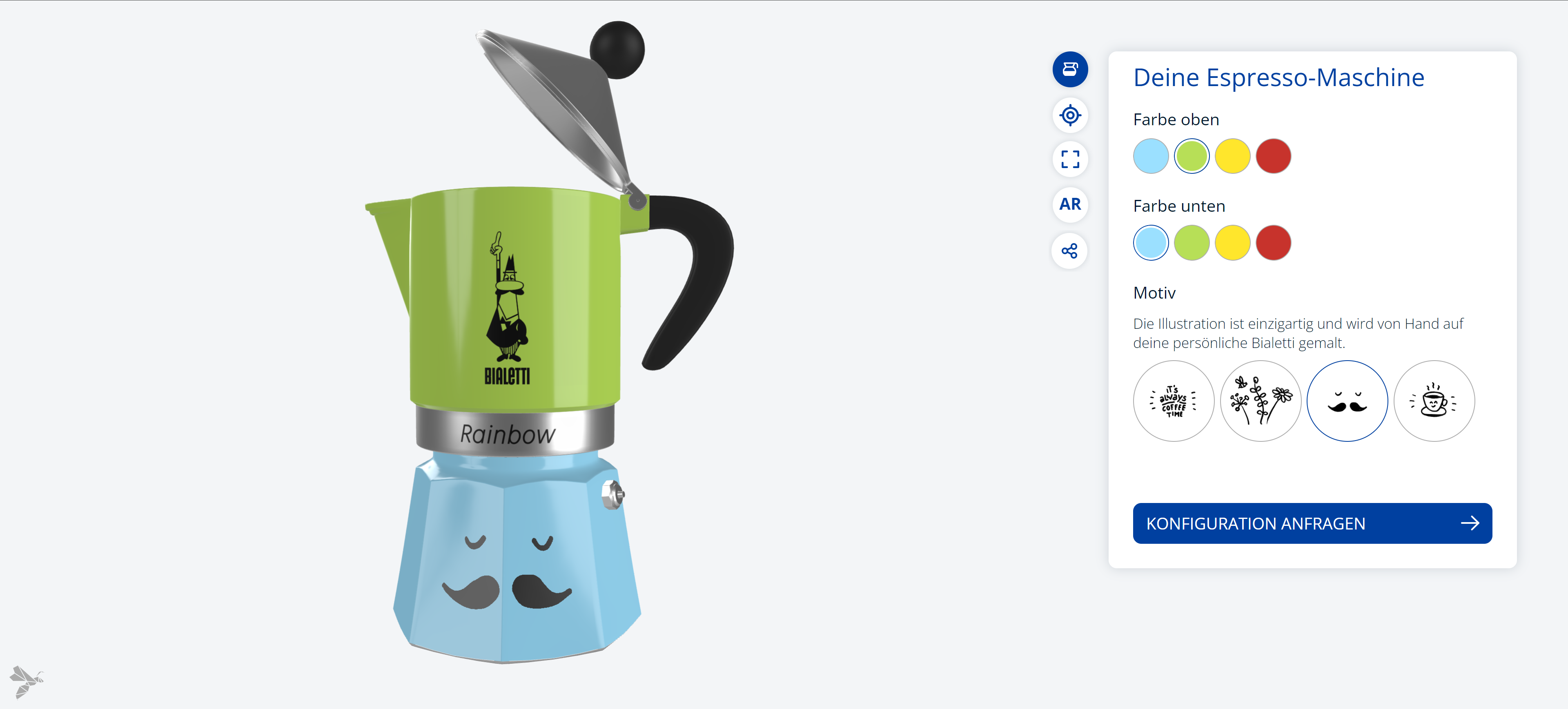
Link to the finished configurator.
Needed content
For the implemenatation you need the following files
Steps to reproduce
To achieve the functionalities mentioned, the following steps must be implemented.
First steps
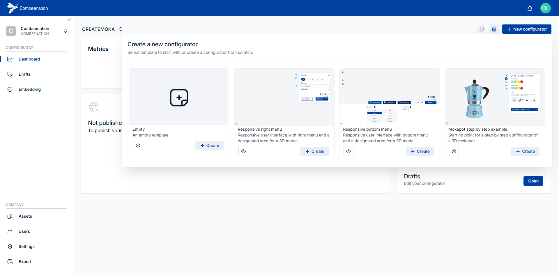
- Create a new configurator based on the
Mokapot step by step exampletemplate.Name: Use a meaningful name of your choiceIDandAsset bundlesare prefilled correctly
If the assigned bundles are changed/renamed, it cannot be guaranteed that the following example can be implemented without any problems.
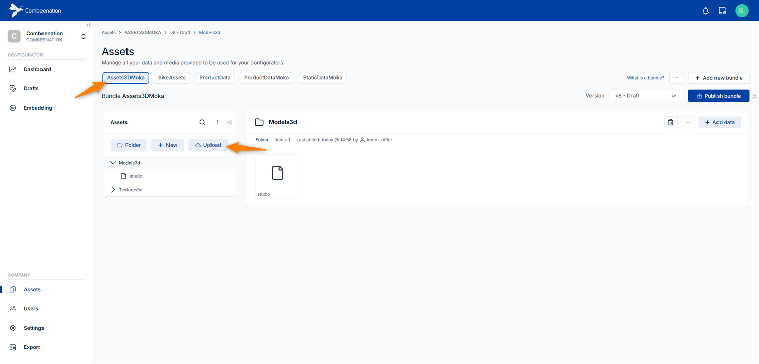
Use the asset manager to upload the
mokapot.glbfile.
Asset bundle: Assets3DMoka
Folder: Models3d
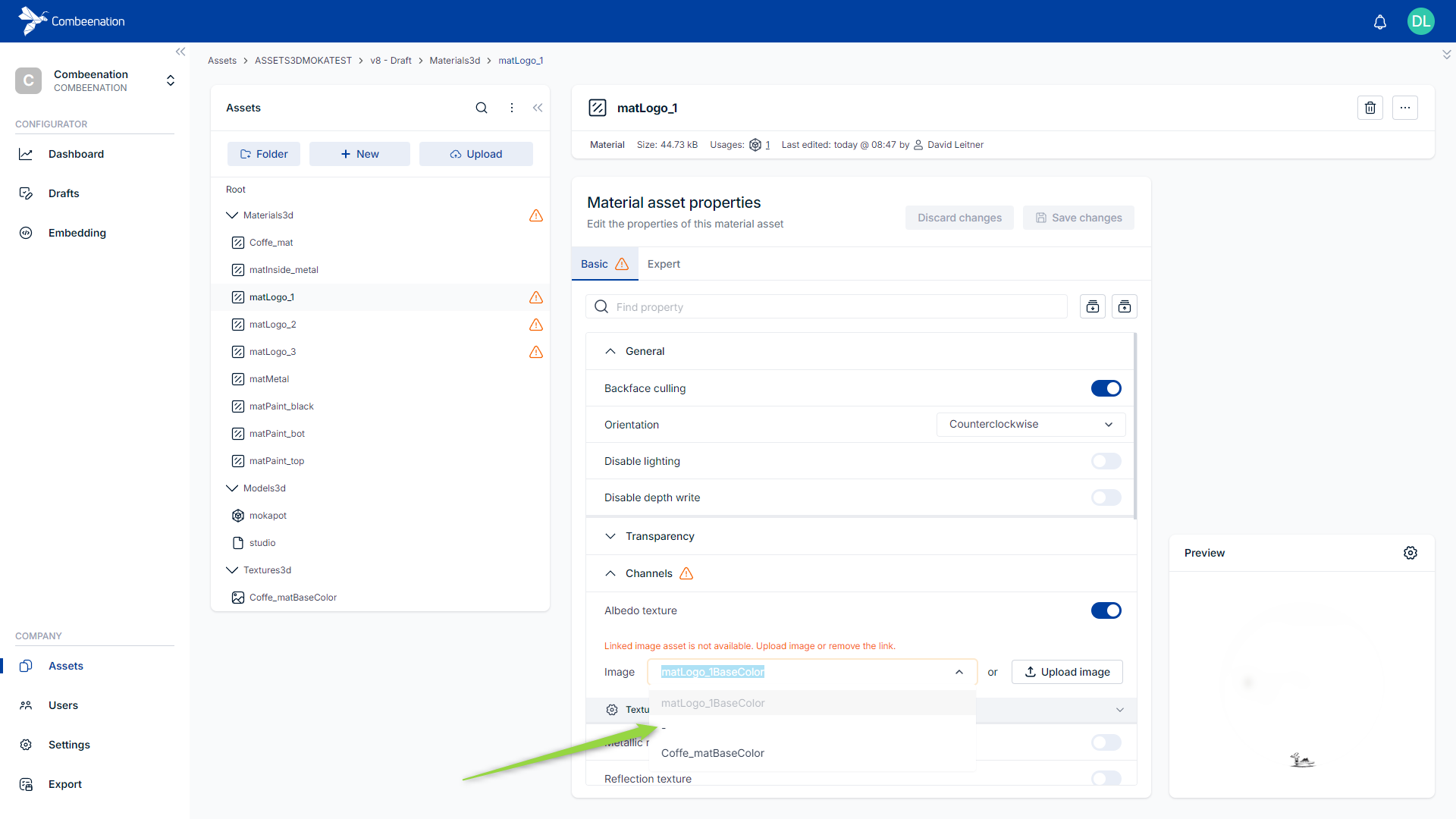
See the documentation for detailed information.Handling textures when uploading your modelThe bundle already contains some textures (see folder Textures3d) which will automatically be linked with the respective material when uploading your model. In general, textures need to be uploaded separately as GLB files encode textures into base64 strings, which might lead to warnings in your Materials3d folder. If such warnings occur, just select the detected asset and set the Image in Channels to
-and save the changes. It's best practice to save your textures separately when exporting your models to GLB (e.g. in Blender or Autodesk Maya). That way you won't run into the described issues with textures being encoded to base64.
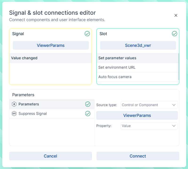
Add the following line of code to the
ViewerParamsvalue component.Viewer3d.modelParameter(Models3d.mokapot, "visible", true)To gain more information about this component, have a look at our documentation.
To make the 3D model visible in the viewer, connect the viewer control with the viewer parameters component. Add the following SigSlo.
Change colour individually
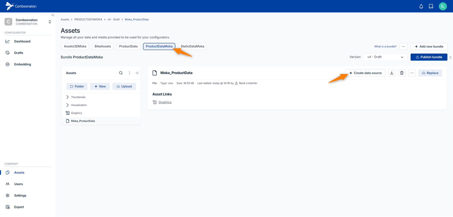
Go to the Asset Editor and create data source
Coloursbased on the file assetMoka_ProductData(see Create data source)
Back in the configurator backend, create a table component named
Colours_Tbl.Load the colours into the component (see Queries). To do this, add the following query to your table component:
from ProductData.Colours select allConnect the table component and dataview for the top colour
Solution
- Set the entries of the dataview
- Open the SigSlo editor.
- As Signal, select your
Colours_Tblcomponent. - As Slot, select your dataview
TopColours_dvwith the optionSet entries. - Set the source type of the entries-parameter to
Control or Componentand select yourColours_Tblcomponent, for property selectValue.
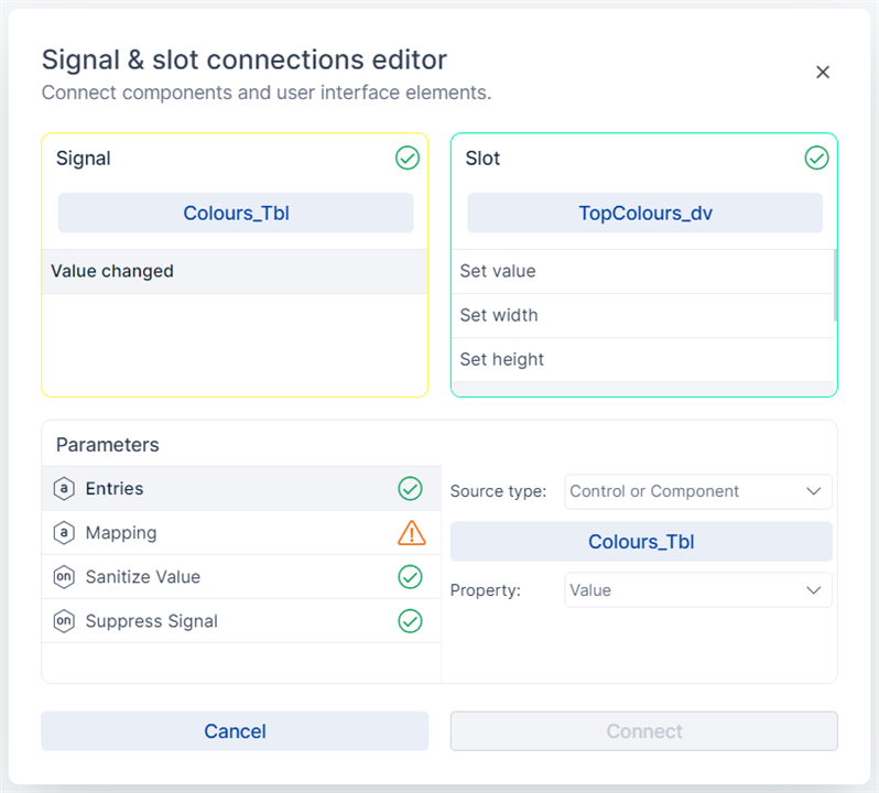
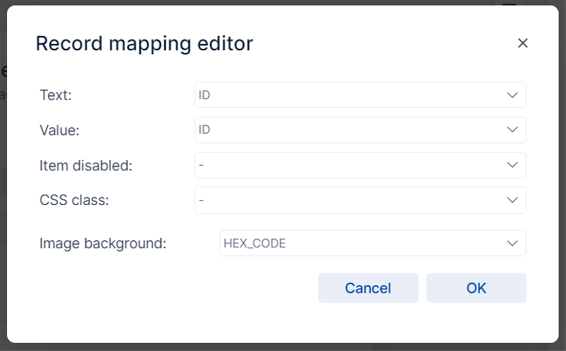
- Edit the mapping-parameter so that
TextandValueis mapped toIDandImage backgroundtoHEX_CODE.
- Write selection changes from the dataview back to the value component
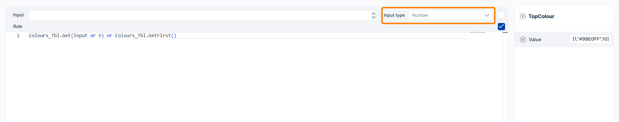
- Create a value component with the name
TopColour. - Add the following code to the component
Colours_Tbl.Get(Input or 0) or Colours_Tbl.GetFirst()Set the input type of the component to
Number.
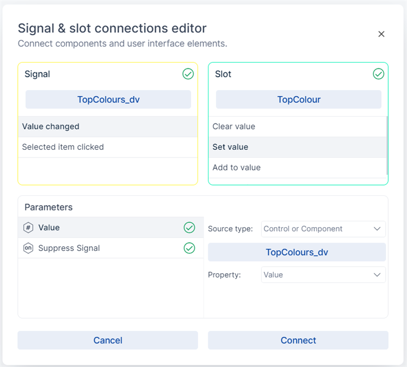
Open the SigSlo Editor
As Signal use the
TopColours_dvwith theValue ChangedsignalThe Slot is your created
TopColourvalue component with the optionSet valueSet the source type of the entries-parameter to
Control or Componentand select your controlTopColours_dv, for property selectValue.
- Write selection changes from the value component back to the dataview.
- Go to the
TopColours_dvdataview and enable Hive for the dataviews value property, by clicking on the code icon next to the input field - Open the Editor by clicking on the Value label
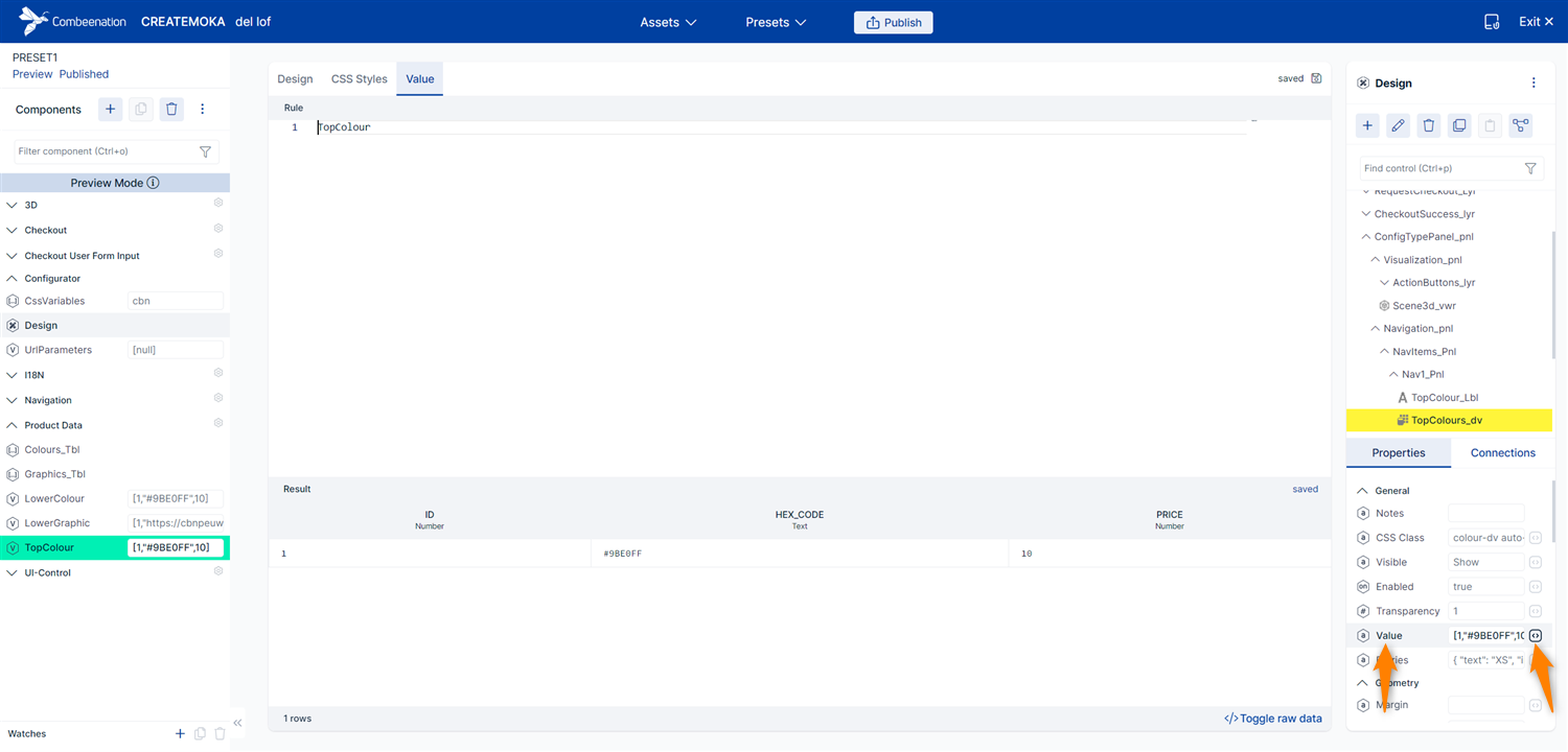
- Get the data from the value component
TopColourby writing a simple script like
TopColourConnect the table component and dataview for the lower colour
To do this repeat step 4. When creating value or table components use the word
Lowerinstead ofTop.Following components and controls are needed:
Colours_Tbl,LowerColour,LowerColours_dvMake colour changes visible in 3D
Adapt the viewer parameters in the
ViewerParamscomponent. Add the following lines of codeViewer3d.materialParameter(Materials3d.matPaint_top, "color", TopColour.HEX_CODE), Viewer3d.materialParameter(Materials3d.matPaint_bot, "color", LowerColour.HEX_CODE)
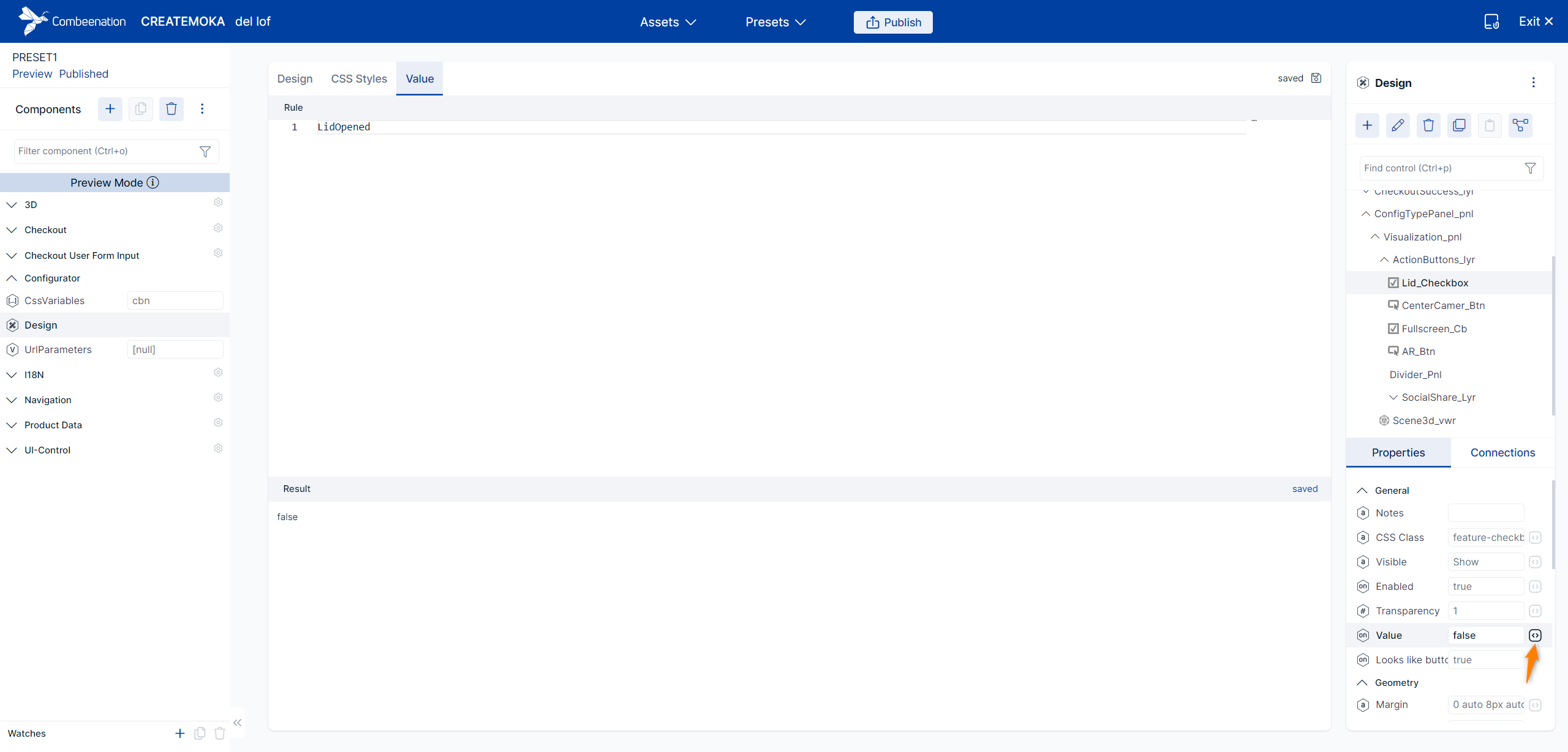
Open/Close lid
Create a new value component named
LidOpened, to store if the lid should be opened or closed.Set the input type of the component to
Logicand add the following scriptif Input is Empty then false else Input endTo store the user input, connect the checkbox with the value component. To do this, create a SigSlo (the button with the node-like icon in the top right corner of the Controls panel) with the shown settings below.
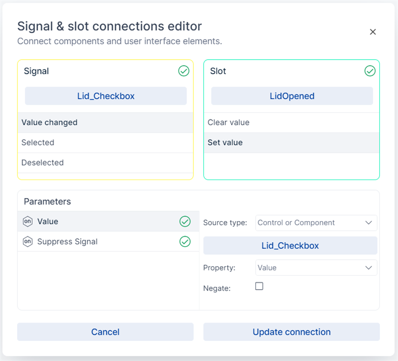
You also need a connection in the other direction. If the value in
LidOpenedchanges, the checkbox has to be updated.
For that, enable Hive for the checkbox value property by clicking on the code icon next to the input field.
Set the position of the opened/closed lid. To do this, you have to adapt the
ViewerParamscomponent. Add the following line of code to make the animation visible in 3D.Viewer3d.nodeParameter("Toplid", "rotation", if LidOpened then "(-45,0,0)" else "(0,0,0)" end)
Display a individual motive on the bottom part
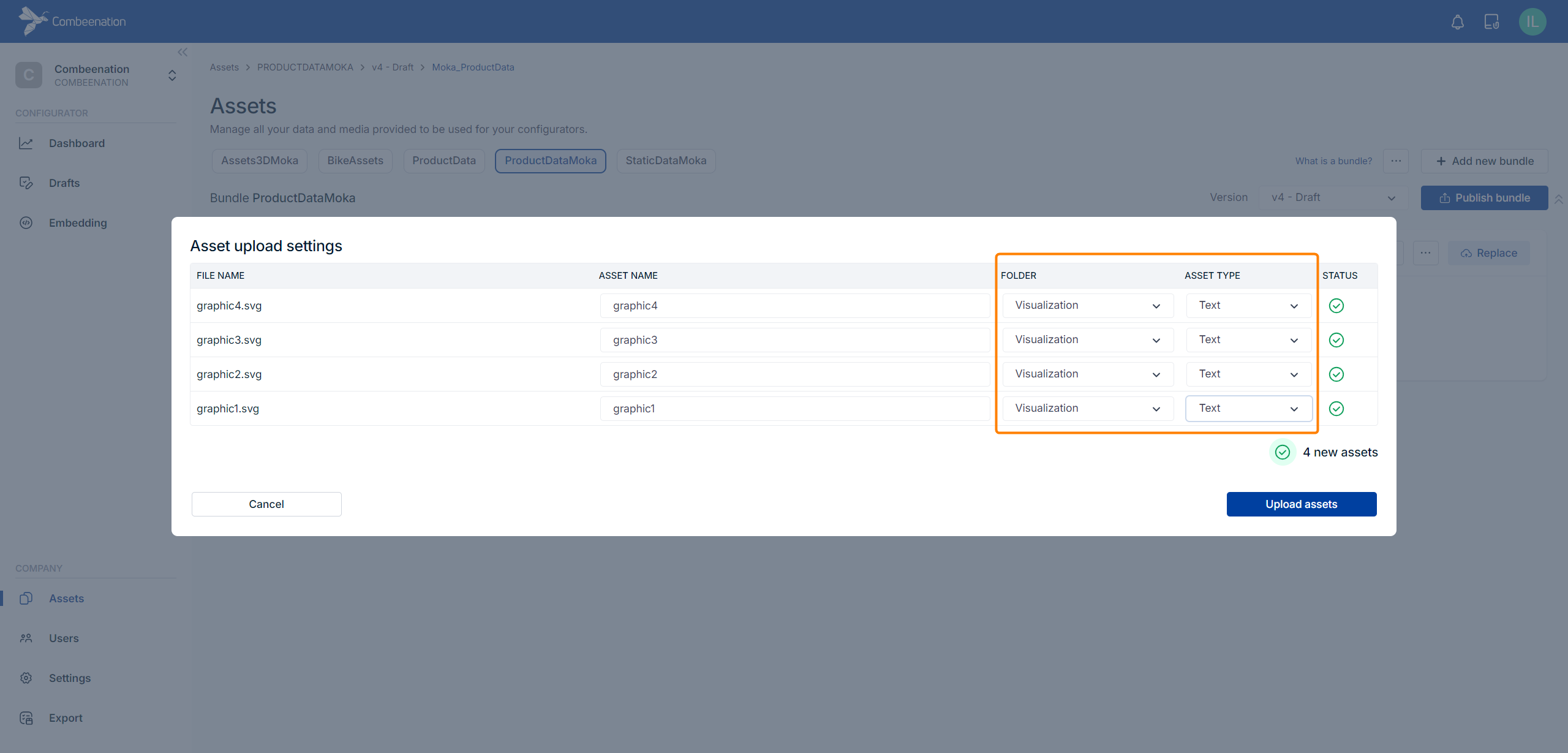
Upload the images
graphic1.svg,graphic2.svg,graphic3.svgandgraphic4.svgas text assets in the asset manager. Make sure that the uploaded SVG files do not contain anyDOCTYPEorxmltags as they must only include the puresvg.
Asset bundle: ProductDataMoka
Folder: Visualization
Asset type: Text
The corresponding data is already available in the configurator (components
Graphic_TblandLowerGraphic).Create a new Graphic component named
TextureView.
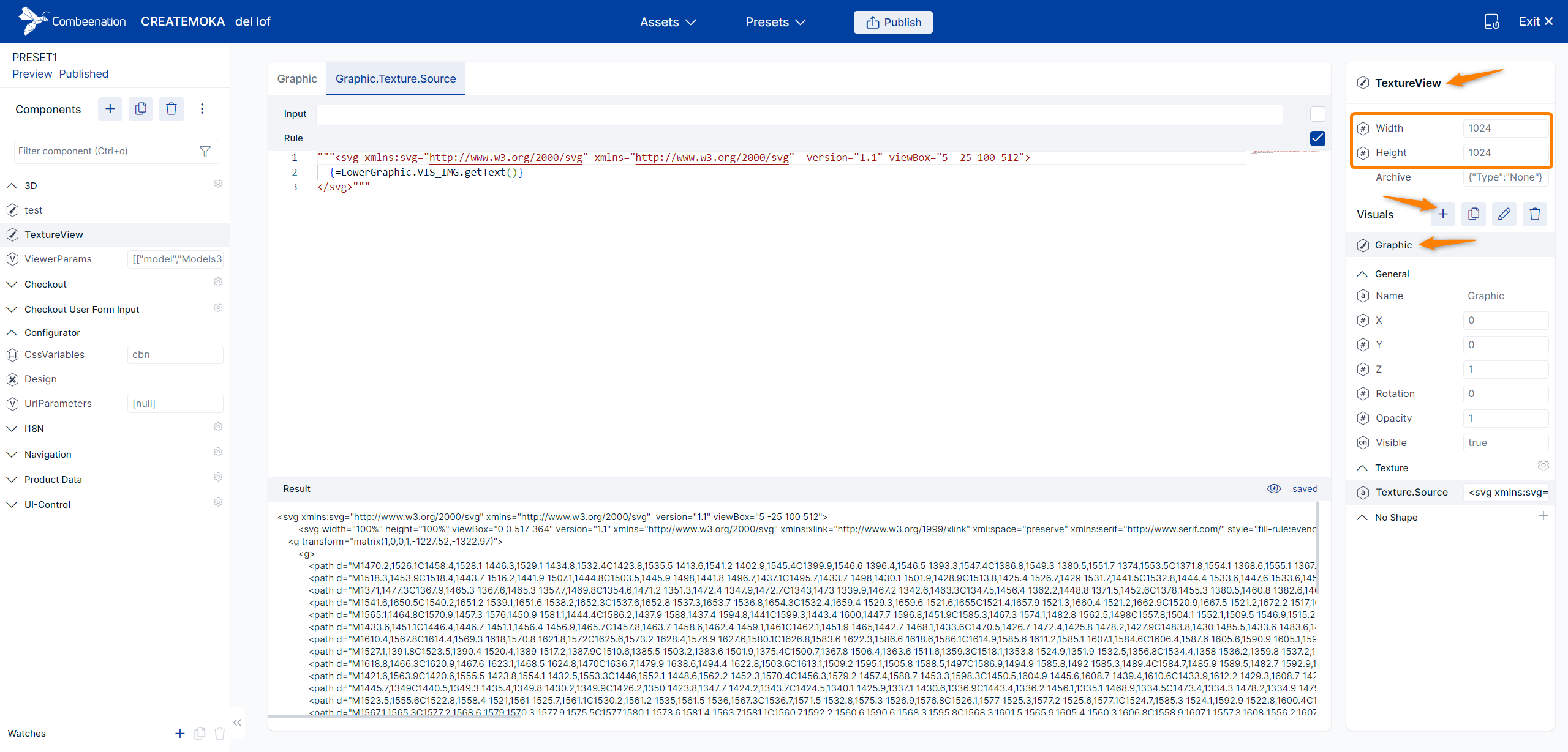
- Set the size to 1024 x 1024px. Please click on the texts (Width, Height) to bring up the component editor rather than entering the values directly into the input field.
- Add a new Visual of type
Single Visual→SVGand name itGraphic. - To show the chosen image, set the
Texture.Sourceto"""<svg xmlns:svg="http://www.w3.org/2000/svg" xmlns="http://www.w3.org/2000/svg" version="1.1" viewBox="5 -25 100 512"> {=LowerGraphic.VIS_IMG.getText()} </svg>"""
ViewBox
Nesting the motive within a parent svg element is necessary in this example as we want the motives to have a certain size, which is given by the outer svg's viewBox attribute.
- To display the motive on the mokapot use a so called paintable.
Add the following line of code to theViewerParamscomponent.Viewer3d.materialParameter(Materials3d.matLogo_2, "paintable", { src: TextureView.Value.ToText(), uScale: 1, vScale: -1 }.ToText())
Blend mode
The paintable will most likely just show a black surface instead of the expected motive. If so, head over to the Asset Editor, go to the Materials3d folder and select the matLogo_2 material. Head over to the Transparency section and set the Transparency mode property to Alpha blend and test.
AR mode
To make the AR button work, you have to create a SigSlo with the Start AR slot.
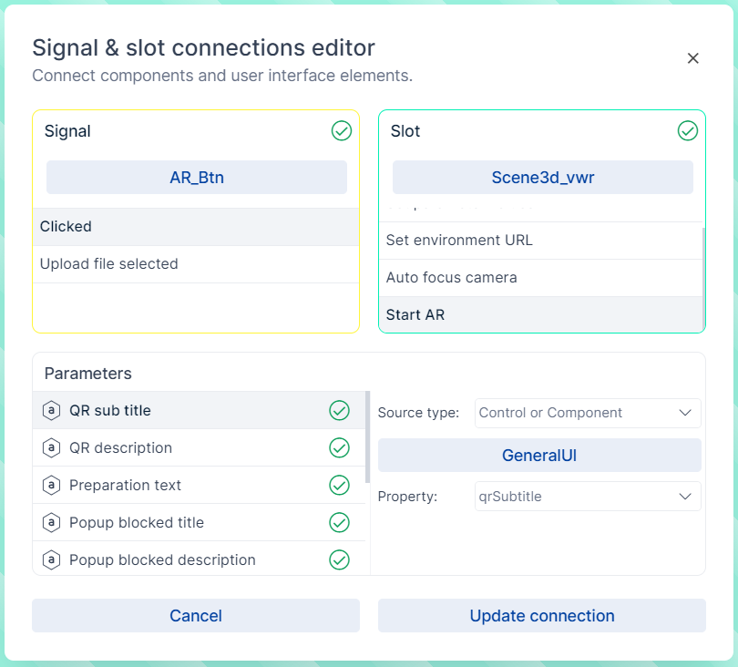
Adjust the parameters below. These parameters are essentially texts displayed in the User Interface. By default, those values are static and filled with texts in English. If you want this texts to be dependent on the currently selected language, you might want to link to a component containing translations. In our example that's the GeneralUI component which holds dedicated columns for those AR-related texts.
| Parameter | Source | Property |
|---|---|---|
| QR sub title | GeneralUI | qrSubtitle |
| QR description | GeneralUI | qrDescription |
| Preparation text | GeneralUI | arPrepText |
For detailed information about the AR mode have a look at the documenation.
Auto focus camera
The auto-focus camera is used to find a default position, where all nodes are visible in the scene. To make the CenterCamera_btn work you have to create a SigSlo with the following settings.
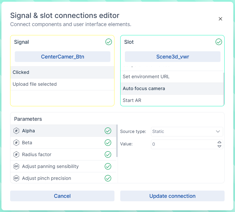
For a good camera perspective, adjust the parameters as follows
Alphato180,Betato90andRadius factorto1.4.
See auto focus camera for detailed information.
Was this article helpful?